CRAFTED BY NATURE,
GUIDED BY DESIGN

I first collaborated with Oilori back in 2023, when the brand was still discovering its visual tone. In 2025, they returned with a clear goal — to refresh their Amazon presence and upgrade their entire product storytelling across eight SKUs including six roll-ons and two hair oils. The brief was simple:
make the brand look as trustworthy, premium, and benefit-driven as the new product shoot they had invested in.
This project also meant fixing what wasn’t working anymore — outdated graphics, inconsistent shoots, weak messaging, and a visual language that didn’t match Oilori’s new direction.
STARTING WITH THE INTRO BANNERS
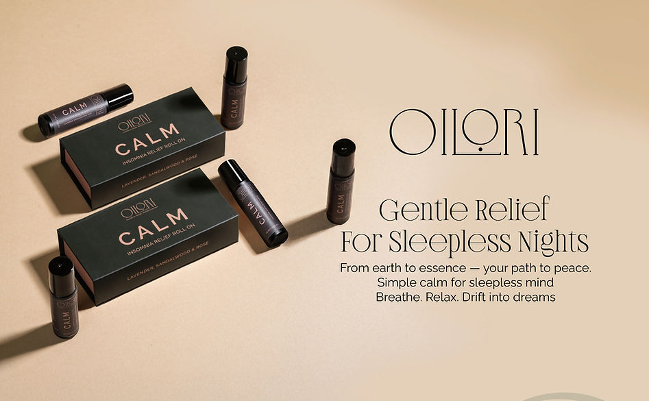
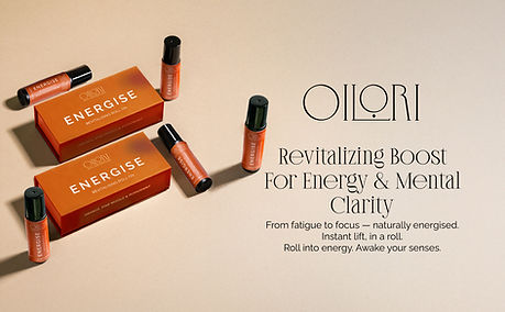
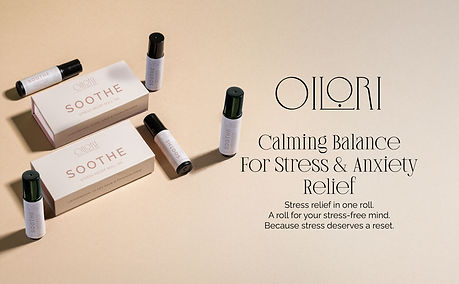
Title Banners That Introduced the Product Clearly
Each product began with a title banner designed to immediately communicate:
“What is this and why should I care?”
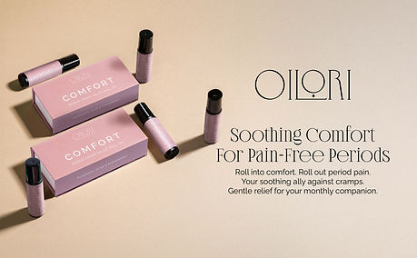
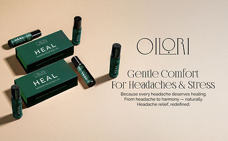
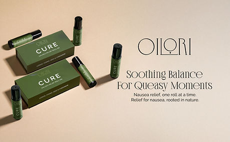
For the roll-ons, this meant capturing the purpose first — Calm, Stress Relief, Migraine Relief, Nausea Relief, Period Pain Relief, and Energizing.
For the hair oils — Anti-Hairfall and Stimulate Growth — the opening panels had to feel authoritative yet soothing.
The title banners set the exact tone Oilori wanted for 2025: clean, vibrant, warm, and rooted in wellness, while still keeping things scientifically credible.


INGREDIENT STORIES

Created Using AI-Enhanced Visuals
One of the challenges was visual consistency. The new shoot covered hair oils beautifully…
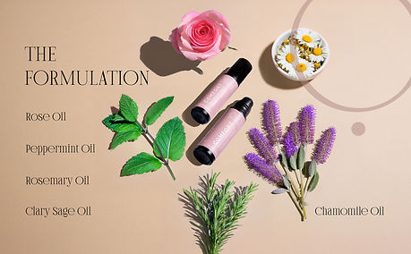
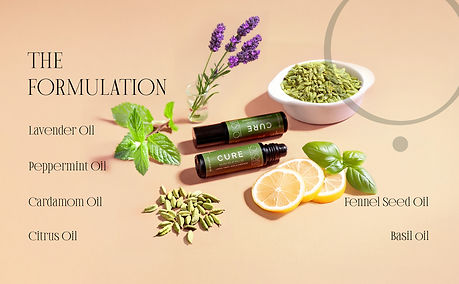
…but the roll-ons didn’t have similar product-focused ingredient photography.
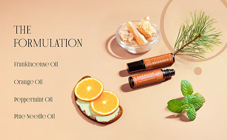
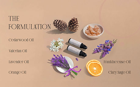
To solve this, I generated detailed ingredient imagery using Photoshop’s generative tools — rosemary sprigs, lavender buds, eucalyptus, ginger, chamomile, and more.
This allowed every banner to showcase ingredients in a unified style, without looking artificial or disconnected.
This shift instantly made the brand feel more premium, modern, and ingredient-led.



KEY FEATURES AND BENEFITS
The Banner That Sells
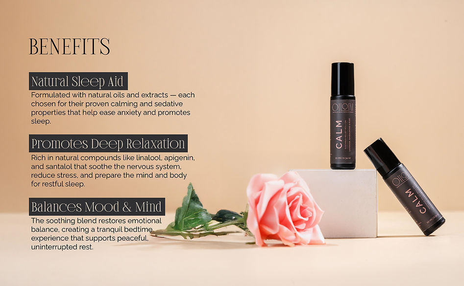
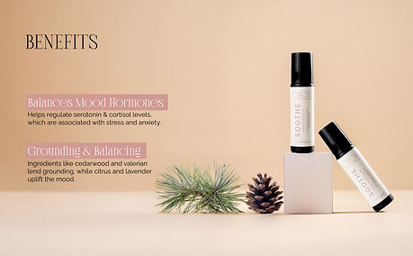
One of the most important additions across every product banner was a dedicated Key Features / Benefits panel — a compact, high-impact module that answers the single most important question for any shopper: “What will this do for me?”
Design approach:
-
Benefit-forward headlines — short, bold statements like “Calms & Relaxes”, “Reduces Nausea”, “Boosts Hair Regrowth”.
-
Fast-scannable layout — 2–3 benefits per product, a one-line explanation, and an optional micro-stat or scientific cue.
-
Contrast & hierarchy so benefits pop first, then supporting claims and CTA follow.




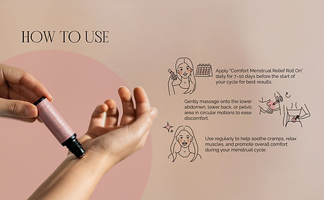
HOW TO USE

The Heart of the banners
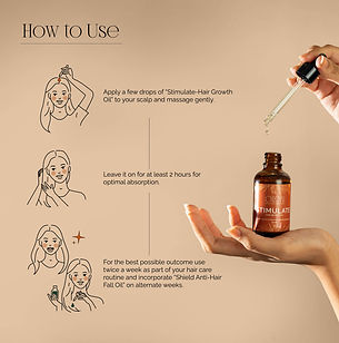
To make usage clearer, I created hand-drawn illustrations that showed exactly where and how to apply each roll-on or hair oil.
These visuals made the product feel approachable, easy to understand, and genuinely helpful.
It also aligned severely with Oilori’s new tone:
scientific + nature-led + practical.


RE-ESTABLISHING BRAND POSITIONING
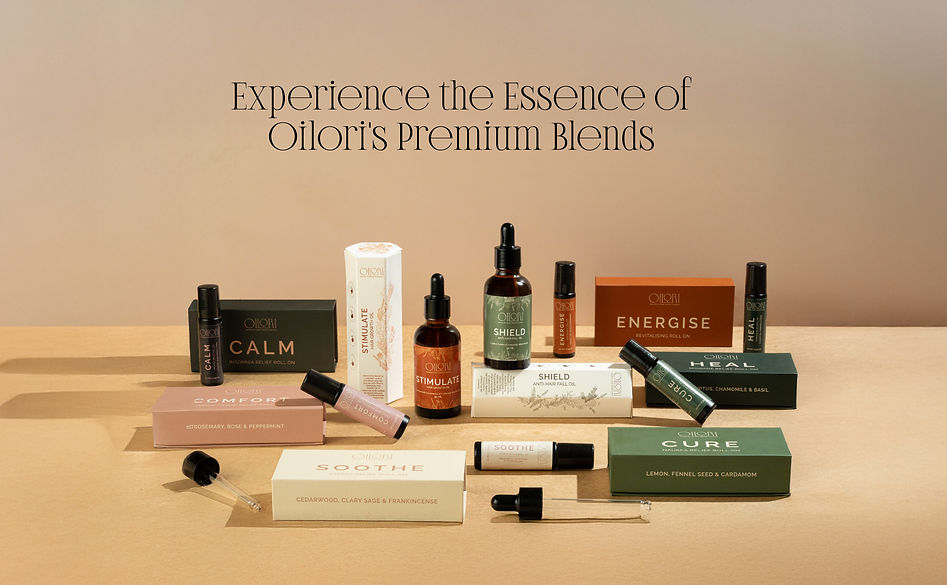
Crafted by Nature, Guided by Science
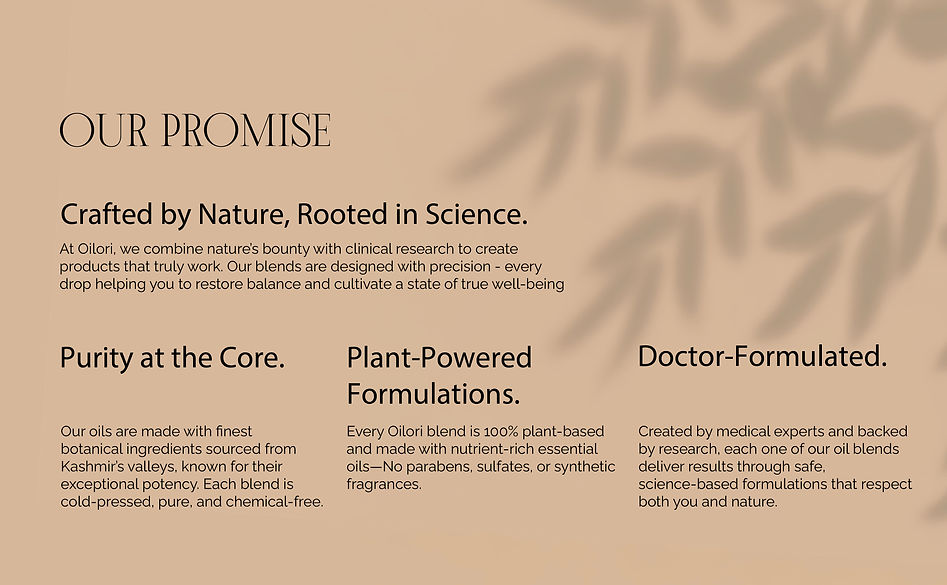
Oilori’s identity is deeply tied to:
-
local Kashmiri ingredients,
-
evidence-based formulations,
-
and a commitment to wellness culture.
The previous Amazon creatives didn’t reflect this philosophy clearly.
So the final panels in each banner included:
-
the brand’s core promise,
-
sourcing ethos,
-
and the complete product range.
This not only unified the eight products visually but also communicated the brand’s long-term values — something especially important for first-time Amazon buyers.
LISTING IMAGES

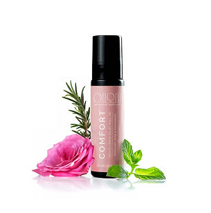
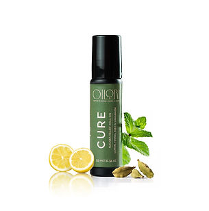


For the Amazon listing images, the goal was to keep the visuals clean, focused, and instantly informative—especially because these are the first images customers see when browsing.
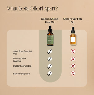
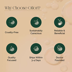
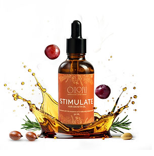
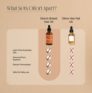
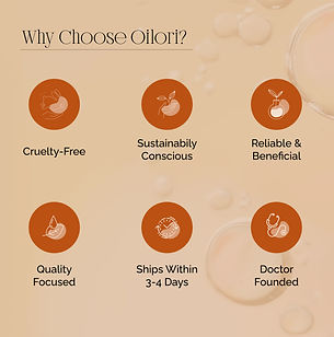
For the hair oils, I created a full set of structured listing images that balanced education with aesthetics. Each image was designed to walk the customer through the product story step-by-step. We started with a clean hero shot on white to match Amazon’s requirements, followed by a clear breakdown of key benefits supported by concise scientific facts. Ingredient imagery was enhanced and styled to keep all visuals consistent with the new 2025 aesthetic, making the listing feel premium and trustworthy. The “How to Use” panels included simple, friendly illustrations to make the instructions easy to understand at a glance. This approach ensured that shoppers not only saw the product but understood why it works and how to use it.
For the roll-ons, the cover images were kept intentionally minimal—clean white background, product front and center, and crisp shadowing for a polished, uniform look. Since the roll-ons didn’t require multiple listing visuals like the oils, the focus was purely on creating a strong first impression that aligned with the cohesive design language across the entire range. This simplicity helped the roll-ons appear modern, fresh, and consistent within Oilori’s upgraded 2025 brand aesthetic.
HAIR OILS





POINT OF SALE
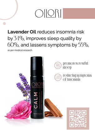
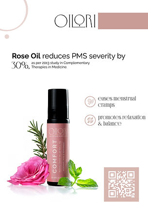
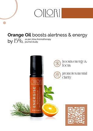
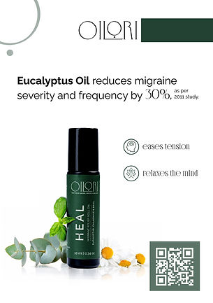
For the exhibition tabletops, I created clean, retail-ready displays that felt premium, minimal, and instantly informative. Each tabletop was designed with a crisp white aesthetic to stand out in a busy exhibition environment while keeping the focus entirely on the product. To bring the formulations to life, I paired every bottle with subtle botanical accents—rosemary, lavender, eucalyptus, or the hero ingredient for that SKU—to create a natural, wellness-led visual story. Each display highlighted two core benefits in a clear, easy-to-read format, along with one concise, science-backed fact about the main ingredient. This balance of nature and evidence helped position Oilori as both trustworthy and premium, while ensuring the tabletop communicated value at a glance to anyone walking past.